Repository navigation
Conversation


|
/deploy-preview |


|
Note: need to drop https://github.com/noahweidig/noahweidig.github.io as it's now using Astro |
|
I might rebase this onto #2222 which offers a better ground for theming, especially to ensure consistency. |
Move the site theme, scripts, Lua filters and page chrome into a local
extension at _extensions/quartoorg/, used through a quartoorg project
type. Pages inherit quartoorg-html from the project instead of naming
it, so the theme is set in one place and a page cannot drop it
silently. This centralises the themes and makes the site easier to
maintain, and it lets #2140 pick up the same chrome.

- Move the page chooser shortcode and the accessibility fixes from
  main into the extension, with their CSS in the theme SCSS.
- Move brand images to assets/images/ and redirect the old root URLs
  that other sites and docs still load: /quarto.png, /favicon.png, the
  og:image files, and the hero and Posit logo images. Files the home
  page still serves from images/ stay where they are.
- Add _tools/check-site-format.ts to CI and the pre-commit hook. It
  fails when a format: html page drops the site theme.
- Dark mode borders use $gray-400, which is 3.70:1 against the page
  instead of 1.08:1. The main banner is brand blue in dark mode too,
  and the prerelease banner moves to #e60033 (white text 4.76:1).

Notebook preview pages still render with the built-in html format, so
they lose the Posit badge, code copy buttons and site grid widths.

See quarto-dev/quarto-cli#14954

Move the site theme, scripts, Lua filters and page chrome into a local
extension at _extensions/quartoorg/, used through a quartoorg project
type. Pages inherit quartoorg-html from the project instead of naming
it, so the theme is set in one place and a page cannot drop it
silently. This centralises the themes and makes the site easier to
maintain, and it lets #2140 pick up the same chrome.

- Move the page chooser shortcode and the accessibility fixes from
  main into the extension, with their CSS in the theme SCSS.
- Move brand images to assets/images/ and redirect the old root URLs
  that other sites and docs still load: /quarto.png, /favicon.png, the
  og:image files, and the hero and Posit logo images. Files the home
  page still serves from images/ stay where they are.
- Add _tools/check-site-format.ts to CI and the pre-commit hook. It
  fails when a format: html page drops the site theme.
- Dark mode borders use $gray-400, which is 3.70:1 against the page
  instead of 1.08:1. The main banner is brand blue in dark mode too,
  and the prerelease banner moves to #e60033 (white text 4.76:1).

Notebook preview pages still render with the built-in html format, so
they lose the Posit badge, code copy buttons and site grid widths.

See quarto-dev/quarto-cli#14954

(cherry picked from commit ac878df)

…nsion (#2290)

Move the site theme, scripts, Lua filters and page chrome into a local
extension at _extensions/quartoorg/, used through a quartoorg project
type. Pages inherit quartoorg-html from the project instead of naming
it, so the theme is set in one place and a page cannot drop it
silently. This centralises the themes and makes the site easier to
maintain, and it lets #2140 pick up the same chrome.

- Move the page chooser shortcode and the accessibility fixes from
  main into the extension, with their CSS in the theme SCSS.
- Move brand images to assets/images/ and redirect the old root URLs
  that other sites and docs still load: /quarto.png, /favicon.png, the
  og:image files, and the hero and Posit logo images. Files the home
  page still serves from images/ stay where they are.
- Add _tools/check-site-format.ts to CI and the pre-commit hook. It
  fails when a format: html page drops the site theme.
- Dark mode borders use $gray-400, which is 3.70:1 against the page
  instead of 1.08:1. The main banner is brand blue in dark mode too,
  and the prerelease banner moves to #e60033 (white text 4.76:1).

Notebook preview pages still render with the built-in html format, so
they lose the Posit badge, code copy buttons and site grid widths.

See quarto-dev/quarto-cli#14954

(cherry picked from commit ac878df)

Co-authored-by: Mickaël Canouil <8896044+mcanouil@users.noreply.github.com>

f63456f to
de706c5
Compare
|
Could someone run a new deploy? |
|
I'll put this as a draft and probably combine with the website redesign as I cannot stack PRs with my current permissions. |

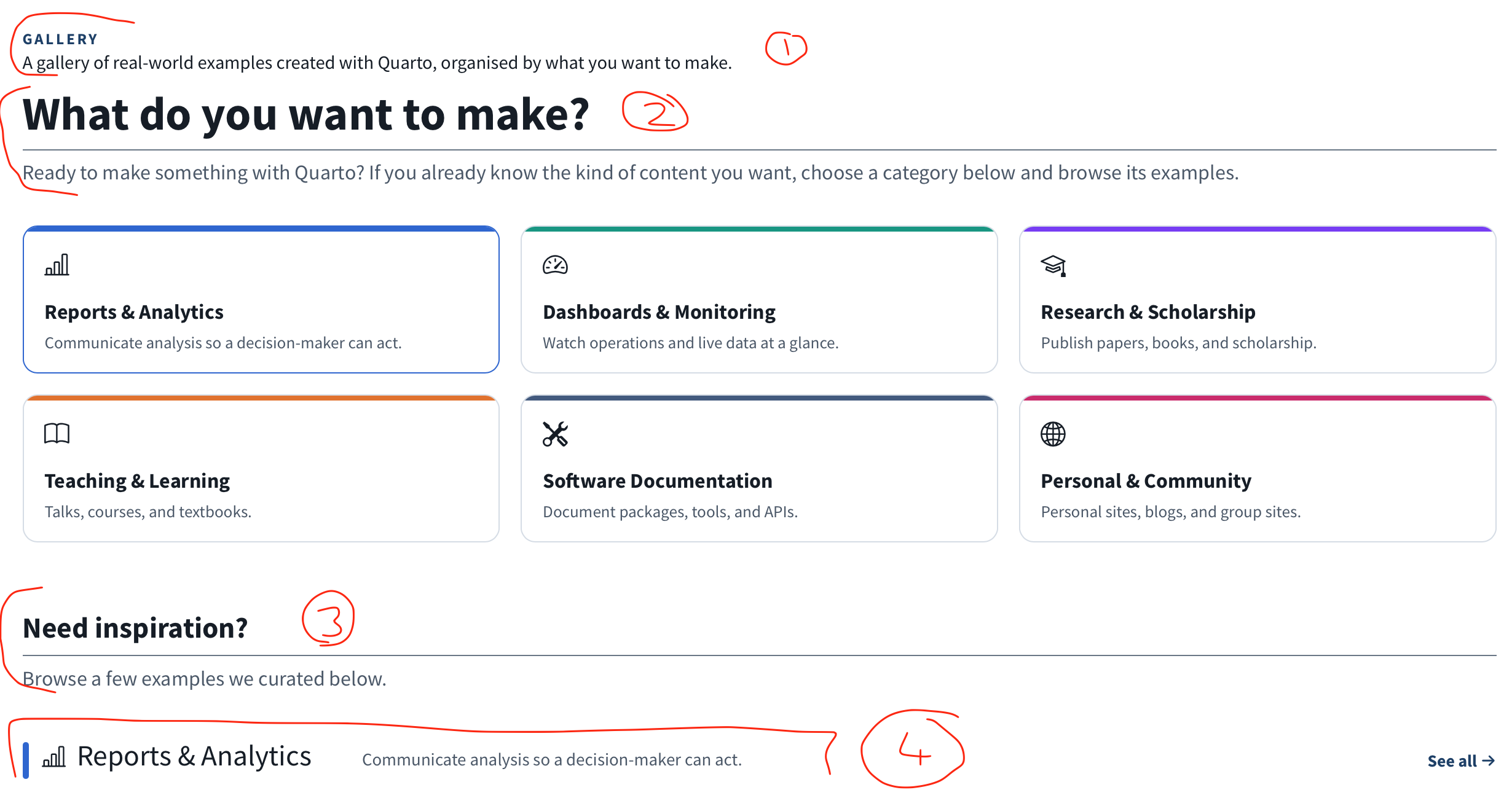
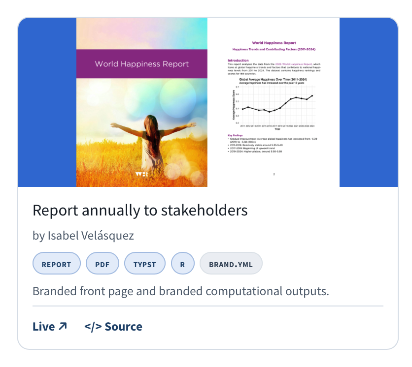
Replace the single carousel gallery with an intent-driven landing and six
category spoke pages. The landing offers a category chooser, a section rail,
and curated featured examples with animated hover previews; each spoke page
lists its examples with keyboard-operable category filters and working sort
and search.

Drive every card from YAML under docs/gallery/data/, with a curated
featured.yml and per-category lists, and single-source the feature links and
browse chips from that data. Consolidate thumbnails under thumbnails/ and add
capture tooling for still, PDF, and video previews, documented in READMEs.

Meet WCAG AA on the interactive chips and heading order, keep the legacy
implementation for reference, and skip the freeze check for the intentionally
deleted freeze entry.
Expose screenshot descriptions to screen readers via a visually-hidden
span, since the thumbnail alt sat inside an aria-hidden link and was
dropped from the accessibility tree. Set the decorative thumbnail
image alt to empty.

Emit a single h1 on the landing by demoting the hero to h2, and stop
category names being announced twice by rendering the chooser titles
as spans instead of headings.

Darken the image-less card gradient so white text meets WCAG AA
contrast, and add an opens-in-new-window cue to external card links.
Cards rendered redundant text such as "rainbowR by rainbowR" where
the name matched the author. Replace those names with the site domain
derived from the live URL so each card reads "domain by author".
The site moved to Astro, so it is no longer a Quarto example.
Its featured slot in Personal & Community goes to mickael.canouil.fr,
which moves up from the same category list.
The card headline and feature chips change to the theming angle, because
the previous framing repeated the story of the isabelizimm.me card beside it.
The palette holds every literal colour of the theme in one file, light and
dark, including the section colours, the gallery categories and the
prerelease red. The tokens expose them as --qorg-* custom properties, with
light values on :root and dark values on body.quarto-dark.

Nothing reads the tokens yet, so the site looks the same.
Quarto exports Bootstrap variables as --quarto-scss-export-* by reading the
text of the defaults layers, and it doesn't follow @import. A Bootstrap
variable set from an imported palette variable would lose its export. As a
theme layer listed after the entry file, the palette's declarations come
first in that text, so the entry files can use them.
Both theme entry files now take their colours from the palette, so no hex
value is written twice. Light mode uses the darker link and muted colours
and a 3:1 border colour. Dark mode moves from grey to navy: page, panels,
popovers, inputs and dropdowns use the palette surfaces, and the grey scale
follows the same values.

Footer text uses the muted colour in both modes; Quarto's own choice only
just met 4.5:1 in light mode.
Every focusable element now shows a 2px solid ring, 2px away, in the ring
colour, which is 3:1 or more on every surface. Bootstrap and Quarto remove
the outline on buttons, nav links, dropdown items, inputs, pagination and the
search box with stronger selectors, so the same rule repeats for those at
matching specificity. The "Supported by Posit" badge draws its frame with an
outline on an id, so it gets its own rule.

The fixed navbar no longer covers the focused element, through
scroll-padding-top. In forced colours the ring uses Highlight. The tool links
drop their own focus rule.
Each navbar section and Guide topic folder now sets body-classes in its
_metadata.yml, for example sec-guide topic-websites, so every page knows its
section without a filter or script. Folders that hold no single topic take
the class of the sidebar section that lists them, and the notebook filters
page, listed under Guide although it lives in docs/extensions, sets its own.

_sections.scss turns each class into two custom properties, --sec for
decoration and --sec-ink for text, with the brand colours as the default for
home and pages outside a section. Nothing reads them yet.
The home defaults for --sec and --sec-ink sat on :root.
A var() in a custom property resolves where it's declared, so :root took the light link colour, and pages without a section class showed it in dark mode too.
The defaults now sit on body, where the dark --qorg-* values apply.
… contents

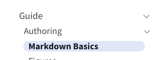
The active navbar item is bold with a 3px bar in the section colour, and the active sidebar entry is bold on a tint of it.
The breadcrumb becomes a small upper case label in the section ink, and the page title and subtitle read as a title and a lede.
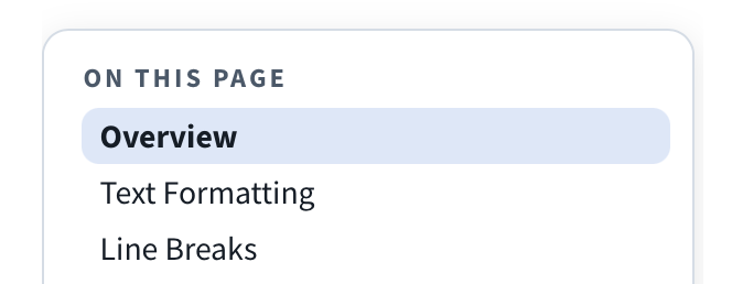
Section headings get a left bar instead of the bottom rule, and the table of contents becomes a floating panel with the page actions under a rule.

_shapes.scss holds the left-bar heading and floating panel mixins, so the gallery can share them later.
Gallery pages keep their own look for now.
The header border and the panel shadow come from the tokens.
Quarto wraps each link card title in a level 2 section, so the left-bar heading rule drew a bar on every card in the Guide and Reference listings.
The Guide and Reference listings now show each card with a line border, the card radius, a 4px bar in the section colour and a glyph box.
Card titles stay h2, and link lists drop the underline until hover.
links.ejs renders an optional icon field as a decorative glyph, and _shapes.scss gains the card shell and glyph box mixins.

Guide cards use the topic glyphs.
Reference cards use file-earmark-text (Documents), easel (Presentations), markdown (Markdown), journals (Wikis), grid-3x3-gap (More Formats), code-square (Code Cells), folder2-open (Projects), tags (Metadata) and terminal (Command Line).

The .carousel, .gallery-category and .card .source-code rules go, as nothing uses them.
Tool links, the tools tabset and the page chooser now draw their tiles from one mixin.
Each tile has a strong line border (3:1), the card radius and the panel surface, and hover shows the section colour.
The current or selected tile adds an inset second pixel in the section colour and a bold label.
This drops the literal tabset colours and the per-component hover rules.
Action buttons set Bootstrap's --bs-btn-* variables from the brand tokens, so every state picks them up, and they keep a 44px minimum height.
The hero's secondary button becomes an outline button with a 2px strong line border.
The dark-only overrides for the hero and download buttons go, as the tokens now carry both modes.

Category chips in title blocks and listings use the new qorg-chip mixin: chip surface, chip ink and line, 20px radius and small caps.
Table header rules are 2px and row rules 1px, both in the strong line.
Quarto draws the outer table rules itself and the cells inherit that colour, so the rule sets border-color on .table and its head.
Code blocks get a line border and an 8px radius on the code surface.
The listing filter and the search overlay field get the strong line border and the chip radius.
The Extensions listing heading, which a page script moves next to the filter, gets the left bar too.
Figure, slide deck and colour box borders, the announcement banner and the document example citations now read the tokens, so they follow the colour mode.
Citations use the link colour in both modes.
The prerelease banner keeps #e60033 with white text, now as palette entries.
The gallery now reads the site tokens instead of its own --gal-* set, and the category colours come from the palette.
Choice cards, the card shell, chips, section headings and the floating rail use the _shapes.scss mixins, which take the category colour where the gallery needs it.
The gallery focus rules go, so every control shows the site ring.

Gallery pages get sec-gallery, so the navbar, sidebar and breadcrumb use the Gallery section colour.
The site chrome now applies on gallery pages too, except section headings and link chips, which the gallery draws itself.
Colour changes are the accepted ones: the light accent becomes the site link colour (#26527a).
Quarto Wizard takes the third featured card on the landing, in place of gribouille.
It also goes third in the Software Documentation list, so the featured set still mirrors the start of that list.
gribouille stays in the list as the fourth entry.

The new card has its own thumbnail and hover clips.
The gribouille hover clips had no other user, so they are gone, and the preview example in PREVIEWS.md now points at the Positron clip.
The guide had three top-level headings.
It now has one title, with the video previews, PDF thumbnails and card thumbnails as its sections.
The home page now has a "Where do you want to go?" block under the hero.
It shows one card per navbar section, each in its own section colour with its glyph, name and a short tagline.
The Blog card says that it opens an external site.

Hello, Quarto sits on a band with a left-bar heading.
The language pills stay Bootstrap tabs, now round and 44px high, and each pane is one card with a language glyph, one line of text, and the source beside the output.
The orange pill colour is gone, because white text on it was 2.69:1.

The feature list gets a Features heading, and each feature title is now an h3 with a topic glyph.
The hero, the bands and the text colours read the tokens, so the home rules in the dark theme are gone.
The filename bar in dark code blocks now takes its text colour from the ink token.
The rules for .bg-color, img.footer-logo and the old hero images had no element to style, so they are gone.
… ci]

The leaflet, Arquero and dygraphs entries are the same defects as before.
Their signatures now name the new dark text and page colours, #e8eef4 and #161f28.
The two bar heading rules, the two hero banner blocks and the two category chip tints are now one rule each.
The home content block loses a padding that every block overrode.
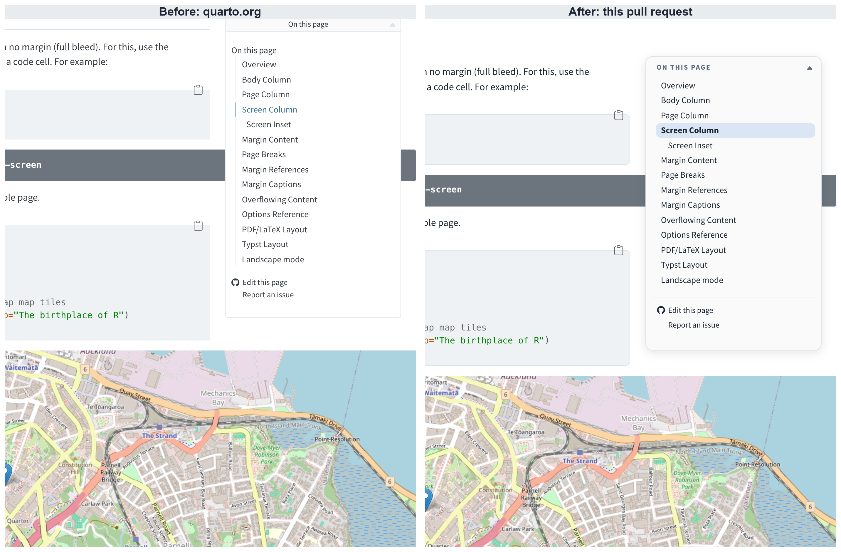
When page content scrolls under the margin, Quarto replaces the table of contents with a toggle that opens a copy of it.
The toggle sat outside the panel rules, so it kept Quarto's square bar, a second heading and the old active entry.
It now uses the same floating panel, the upper case label as its title, and the same entry styles.
de706c5 to
395dfcc
Compare
mcanouil
changed the title

|
/deploy-preview |
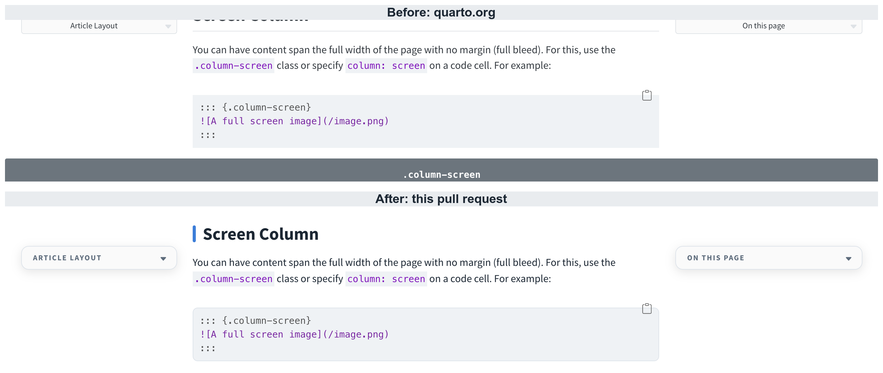
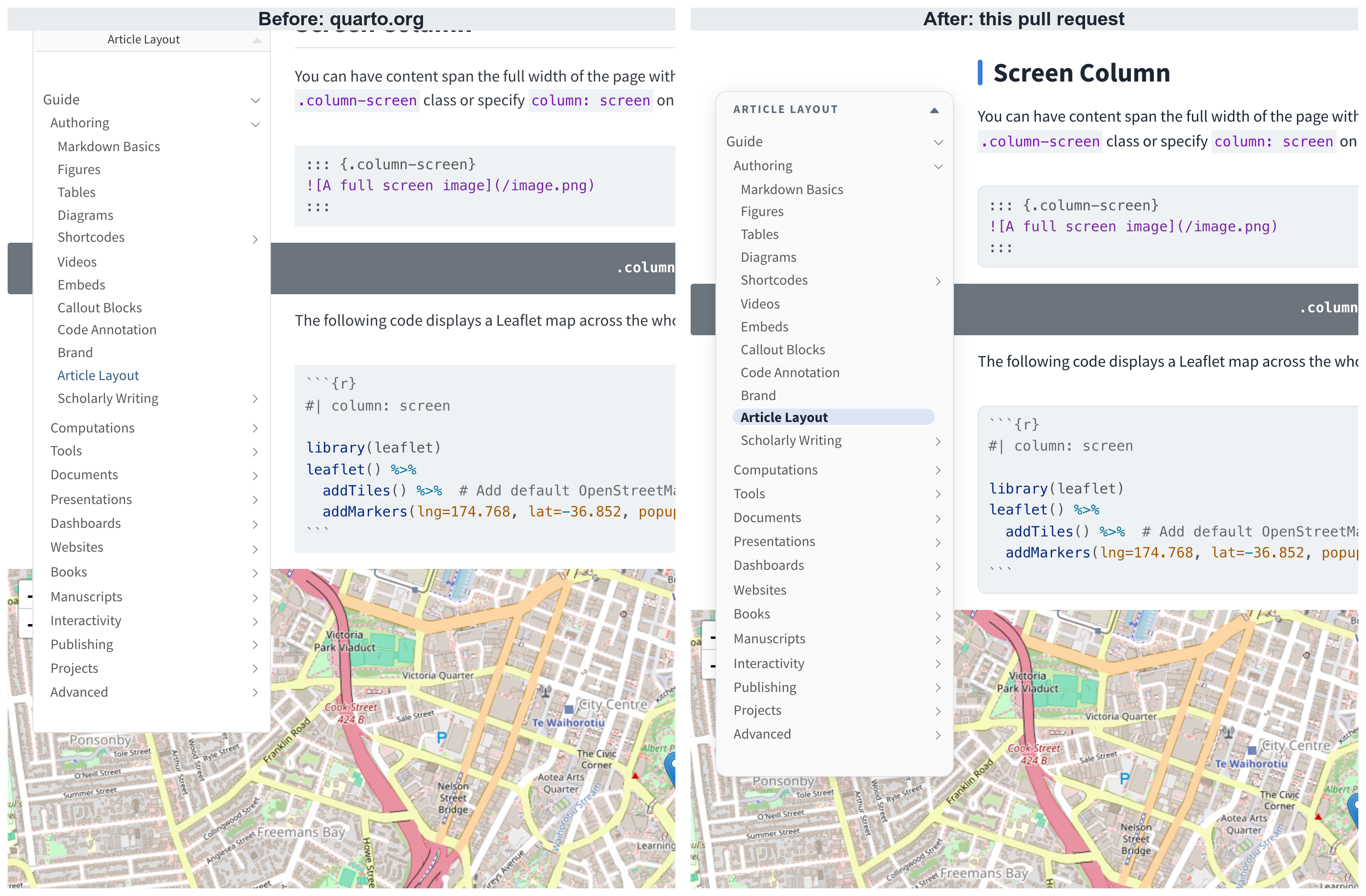
When page content scrolls under the sidebar, Quarto swaps it for a toggle that opens a copy of the navigation.
That toggle kept Quarto's square bar and the old active entry, so it no longer matched the collapsed table of contents next to it.
Both toggles now share the floating panel, the upper case title and the tinted active entry.
|
The collapsed sidebar now matches the collapsed table of contents. 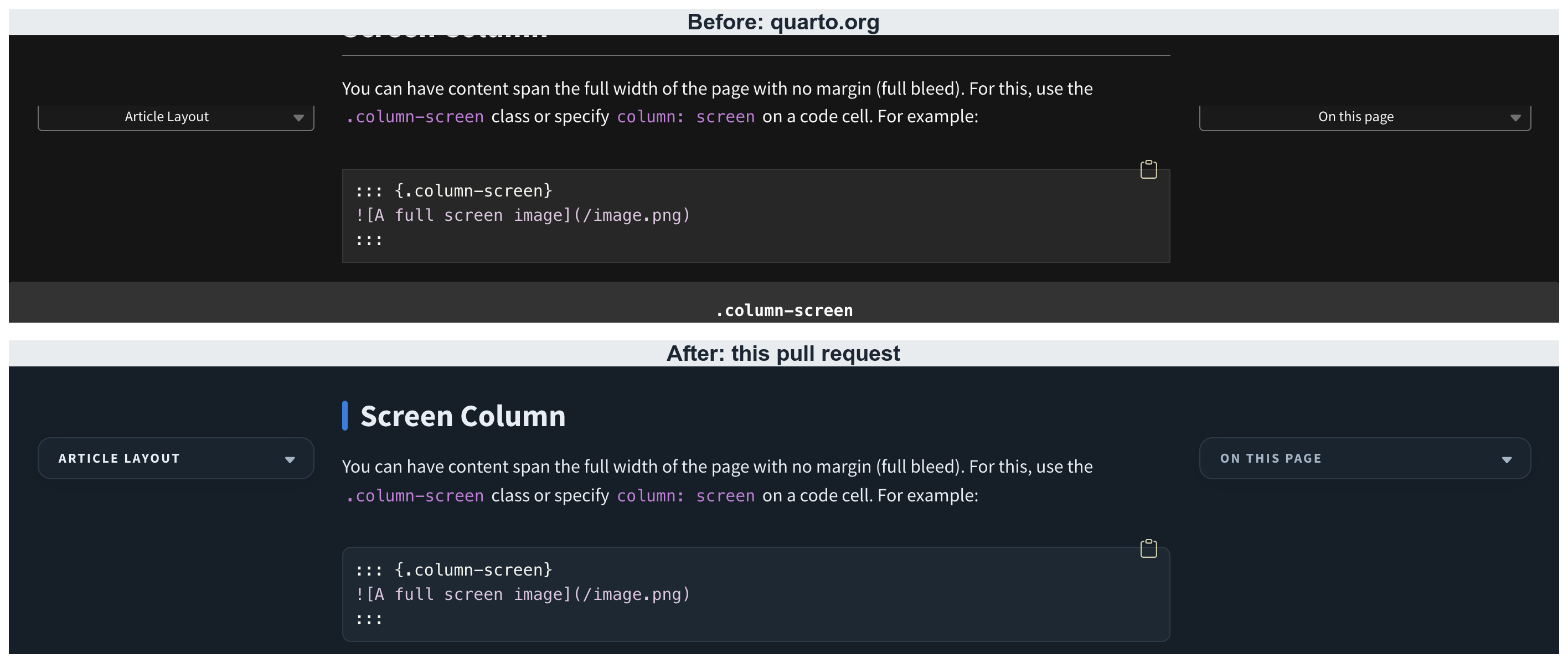
|
Blog posts put the table of contents on the left, and that column keeps Quarto's style.
Styling only its toggle made the table of contents change look when it collapsed.
Quarto sets the toggle background with #quarto-content .quarto-sidebar-toggle, which outranked the panel rule.
Both toggles kept an opaque grey, so they did not match the open table of contents panel.
|
/deploy-preview |
|
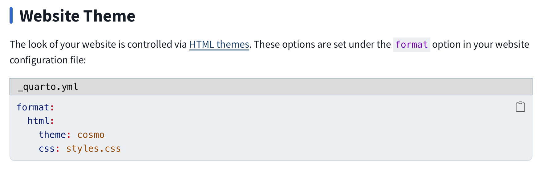
Some feedback split between the design aspects and gallery content. Redesign / Design of galleryOn the redesign, I mostly like the changes. I really like:
There are a few things I think need tweaking:
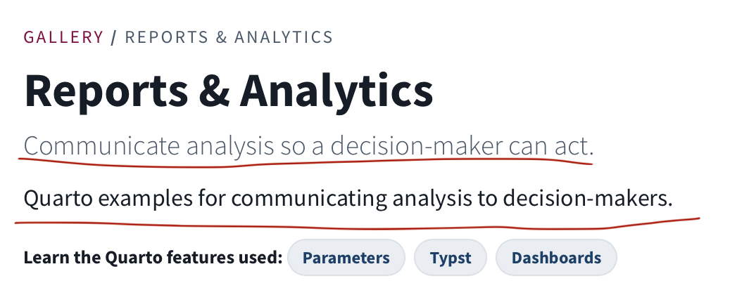
Then finally something I'm not totally sold on yet: the colors for the different sections of the site. I like the idea, I think people struggle to understand that e.g. the Guide and Reference are different parts of the site, and having a color indication helps. I think the green on Get Started, blue on Guide and teal on Reference are fine. I don't like the purple color used on Extensions - it feels maybe too saturated compared to the others, or maybe I just don't like purple. Then on Gallery, the pink-red doesn't show up anywhere on the landing page, and the page introduces its own color codes for "Use Cases" that compete with the site-level ones. Some things we could consider:
Gallery content
|
|
Overall, I agree with your feedbacks.
Collapsed was fixed when I saw the issue from the screenshots. (https://deploy-preview-2140.quarto.org/docs/authoring/article-layout.html#body-column) I wasn't totally into making the sidebar as a floating box like the TOC, it felt wrong, but indeed when the sidebar is in collapse mode and you expand, it's totally similar to TOC. About the gallery part, I did not dive into harmonising it towards to website yet (only website towards gallery currently in the PR). The sidebar being too tight is actually the default line height from quarto.org which because of the more "heavy" mark makes this very obvious. This could go as a more harmonised sidebar/toc. Below are two short screencasts of the sidebar and the table of contents. The first is a wide desktop view: both are fully shown, collapse when the margin content comes into view, and expand again with a click. The second is a narrow view, where the sidebar and the table of contents are collapsed by default. sidebar-toc.mp4sidebar-toc-desktop.mp4 |
|
Use posit colour palette for gallery: https://github.com/posit-dev/posit-brand/blob/main/_brand.yml |


This pull request redesigns quarto.org, with the new gallery as one part of it.
The theme takes every colour from one palette,
quartoorg-palette.scss, through--qorg-*custom properties, and dark mode is navy everywhere.Each navbar section has its own colour, set with
body-classesin the folder_metadata.yml, and the navbar, sidebar, breadcrumbs, headings, table of contents and link cards pick it up.The home page gets a section chooser under the hero.
The gallery replaces the carousel with a landing and six category pages, built from YAML under
docs/gallery/data/and styled with the same tokens.Body text and links reach 7:1, every control shows the same 2px focus ring, and a full-site axe scan finds nothing new.